The basic rules for formatting a novel manuscript are detailed below. Many agents and publishers have a preferred format. Be sure to tailor your submission to meet their preferences. In most cases, the changes required will be minor tweaks.
When to Format
Some writers prefer to format their manuscript before they start. Other wait until they finished with the creative process and focus on formatting afterward. Personally, I start, from the first word, writing in manuscript format. I have several reasons:
- Once you set up your word processor, writing in manuscript format doesn’t take any extra effort.
- I find it easier to review and edit my work when it’s formatted this way.
- I often share my work-in-progress with other writers for critique and they expect to receive it in manuscript format.
Manuscript Format Basics
These guidelines apply to the entire manuscript.
- Font: 12 point Times New Roman or Courier New. (Note: I find Times New Roman easier to read.)
- Font Color: Black
- Margins: 1 inch to 1.5 inches all the way around.
Manuscript Title Page
A novel manuscript requires a title page formatted in this manner:
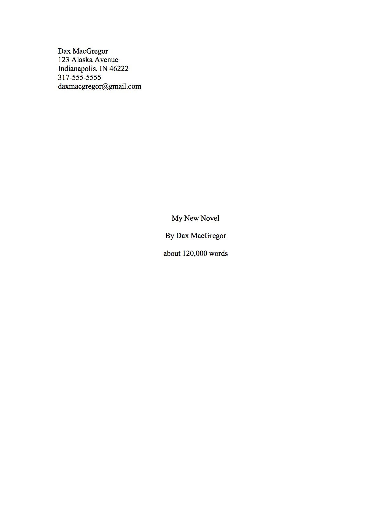
- Contact information: In the top left corner, insert your name, address, phone number and email address. single-spaced and left-justified.
- Title: Centered one-third to one-half the way down the page
- Author: Centered one double-spaced line below the title. Example: by Dax MacGregorNote: If you write using a pen name, show that here; but be sure to show your real name in the contact information above.
- Word Count: On finished manuscripts, you will need to place the word count centered one double-spaced line below your name. Round to the nearest thousand. Example: 120,000 words.
Chapter Title Pages
A Chapter Title Page is formatted just like all other content pages, with the following exceptions:
- Page Break: Start each chapter on a new page.
- Chapter Title: Center the title about one-third to one-half the way down from the top
Content Pages
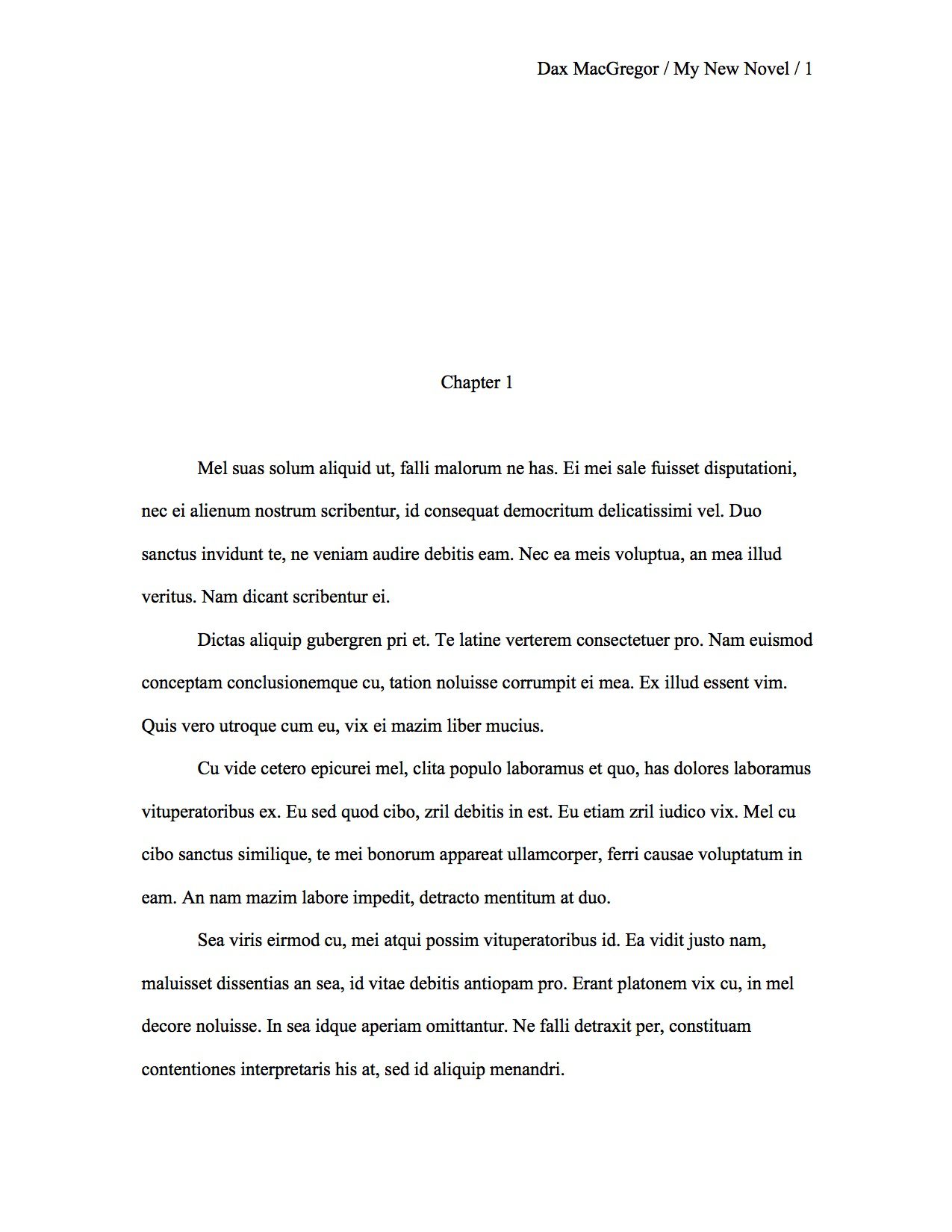
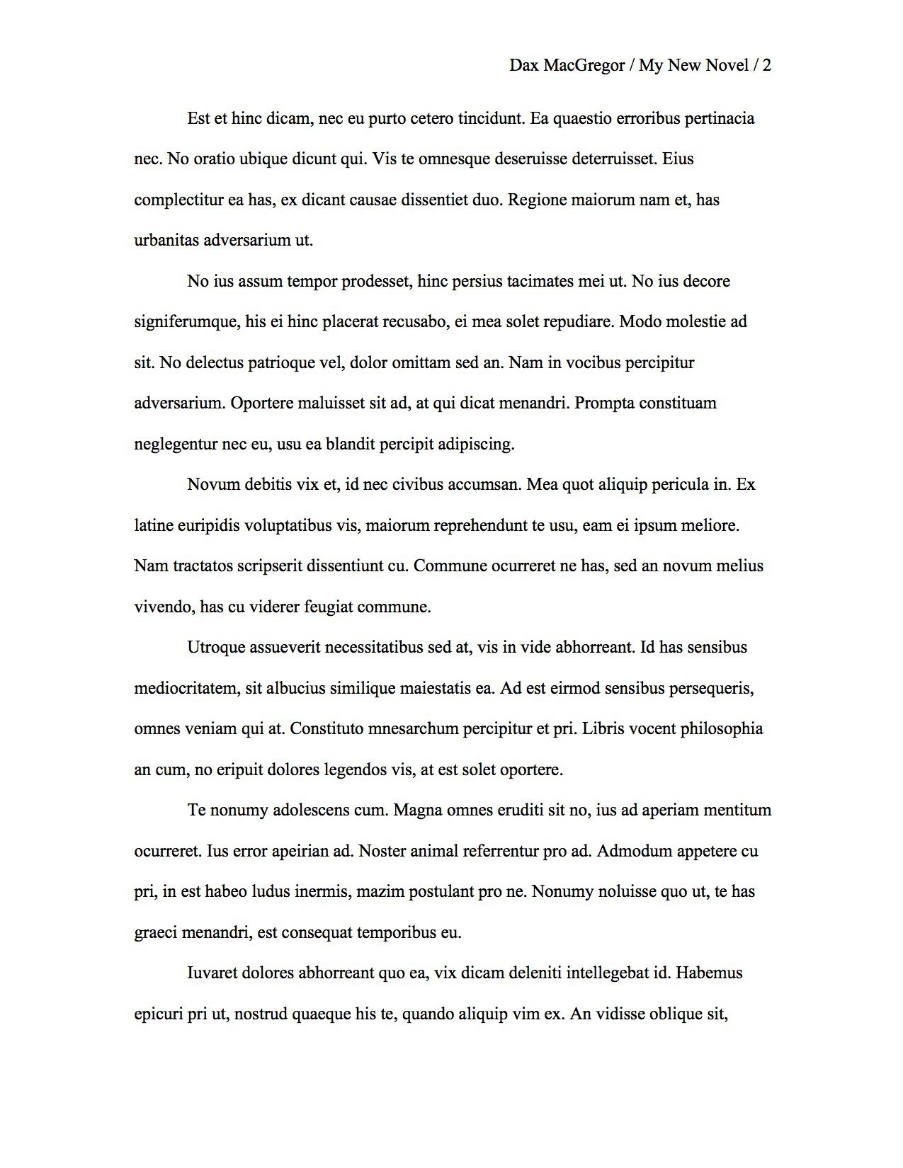
Format the main content of your manuscript per these guidelines:
- Page Header: At the top right of every page, except the title page, display: Your last name / The book title / Page Number. Example: Dax MacGregor / My Story / 152
- Page Numbers: Pages are numbered continuously, with page one being the first page after the title page.
- Paragraphs: Indent the first line of every paragraph by about 1/2 inch.
- Line Spacing: Double-spaced.
- Scene Breaks: Insert a new line with a single hash mark “#” in the center. Optionally, you may use three asterisks in place of the hash mark.
- Dialogue: Start a new paragraph every time you change speakers. There are so many special formatting rules that apply to dialogue that it has its own page: How to Format Dialogue.
- Separation between sentences: One space. (I learned to type when two-spaces after each period was the rule. I still catch myself inserting extra spaces. Periodically, I do a global search-and-replace to eliminate them.)
- Italics: Italicize (The old school rule was to underline all italicized words.)
- The End: Center the word “END” after the final line of your story.
Examples
Note: Click to Enlarge
Mistakes to Avoid
Be sure your manuscript doesn’t contain any of these common pitfalls:
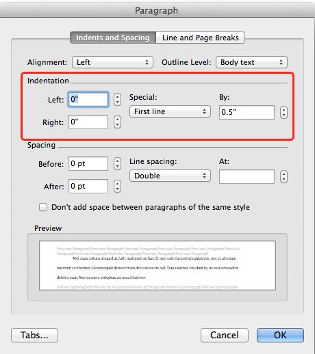
- Don’t indent using tabs or spaces. Use the format paragraph feature of your word processor. (See image on the right.)
- Don’t justify your paragraphs. Your right margin should be ragged. Justifying creates uneven spacing between the words that makes it harder to read.
- Don’t place extra lines between your paragraphs.
- Don’t restart page numbers with each new chapter.
- Don’t forget to do one last spell check before printing.
Printing
These days, agents and publishers will request manuscripts to be submitted electronically. However, if you need to submit a paper version, be sure to:
- Use high-quality paper, 20 or 24 pound, with a brightness score in the high 90s. You want to make the right impression. Don’t skimp on cost here.
- Single sided.
- Print your manuscript on a good quality printer, preferably a laser printer.
Final Notes
I’ve assembled this information based on recommendations from multiple references, discussions with experts, and personal experience. I update it as the standards evolve. Remember, before you submit a manuscript to an agent or publisher, be sure to review their specific requirements.
You might enjoy this article: Farhad Manjoo: Space Invaders: Why you should never, ever use two spaces after a period.
If you have something to add or corrections to offer, please leave your comments below.
Comments
Related Posts

Condense a Novel into One-Page Synopsis
Sooner or later you will need to condense your entire novel down to a one-page synopsis. For novelists, it’s a herculean task. Here’s how I did it.
Till, ‘Til, Til or Until? Which is right?
I was sure that till meant breaking up dirt; that until meant “up to the time of”; and, when people shortened until in speech, you wrote it as ’til – or maybe just til. But, after a little research, I learned I had it wrong.

How to Overcome Writer’s Block – A Compendium of Solutions
I’ve compiled the best tips on overcoming writer’s block from all around the web. If your stuck, here are some great ideas to help you break through.

Pantser to Plotter
My brother wrote, “I’m a pantser. My guess is that you’re a plotter.” He was only partly right. Things aren’t always black or white.